Over the past week I did some java script with google viz API prototyping. As I collect data from my energy manager with metohub over several months I have too many data points for a gnu-plot graph. Here is my current result:
- EvalMetohubJS-ScreenShot.png (48.88 KiB) Viewed 12420 times
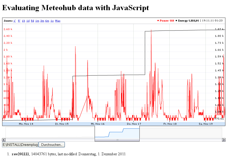
The red line shows the power in Watts and the black line the consumed total energy in kWatts. With the control panel I can select the time frame. The mouse over allows inspecting single data points. The data is uploaded from a single or multiple meteohub raw files.
I would like to add annotations (e.g. for data measurment errors).
Is there anybody willing to join this development?
